





IDEAXProject Delivery Blueprint · Branding & Packaging
- Client Partner
- RM & Sons Pvt. Ltd.
- Target Industry
- Personal Care & Hygiene
- Year
- 2025
- Live URL
- Private
Scope Description
Deliverables
- Brand Guidelines
- Logomark & Symbol
- App Icon
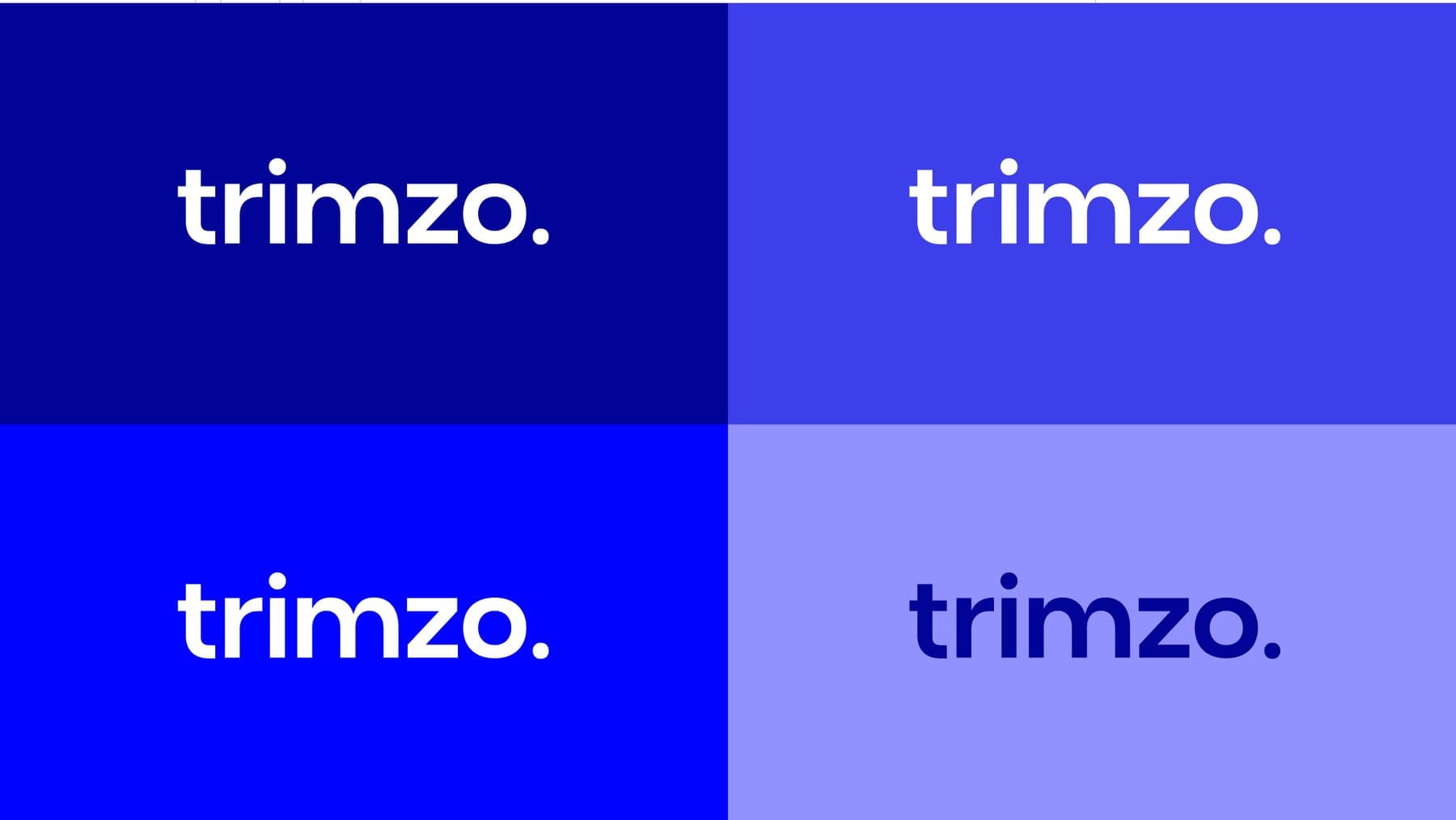
- Colour System
- Typography
- Packaging Design
- Digital Mockups
Brand Mission
Trimzo aims to redefine men's grooming by delivering precision-engineered razors that provide a smooth, comfortable, and premium body shaving experience — combining modern design, advanced blade technology, and affordable luxury to help men look sharp and feel confident every day.
- Uncompromising Quality
- Precision
- Innovation
- Confidence
Colour System
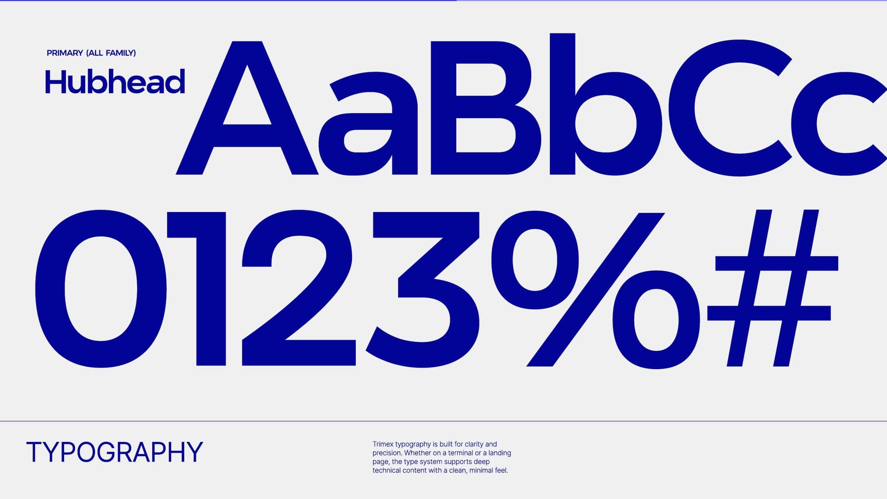
Primary Typeface
Hubhead
Built for clarity and precision — a clean, minimal type system that scales from the packet front to digital touchpoints.
01 — Identity
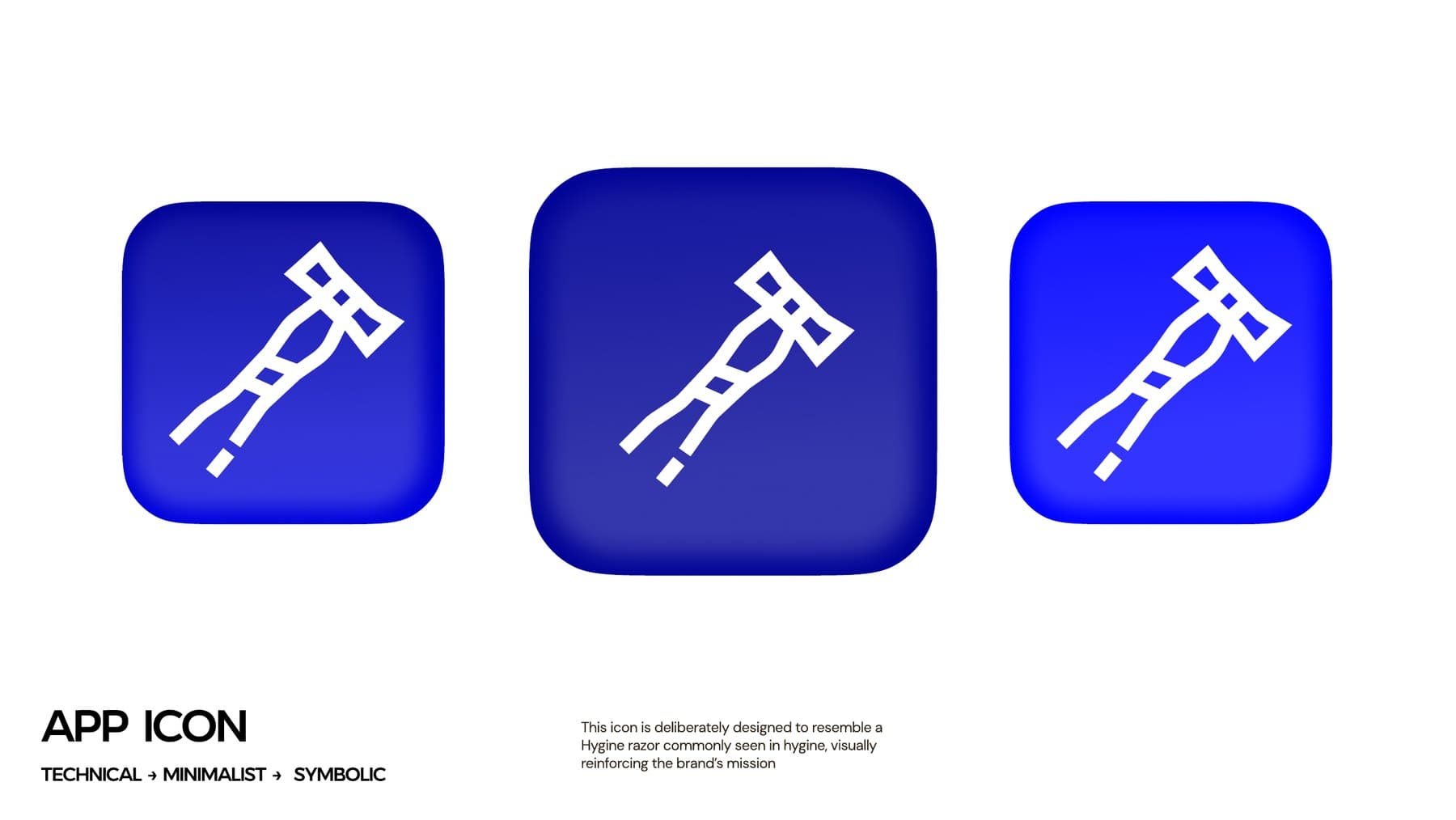
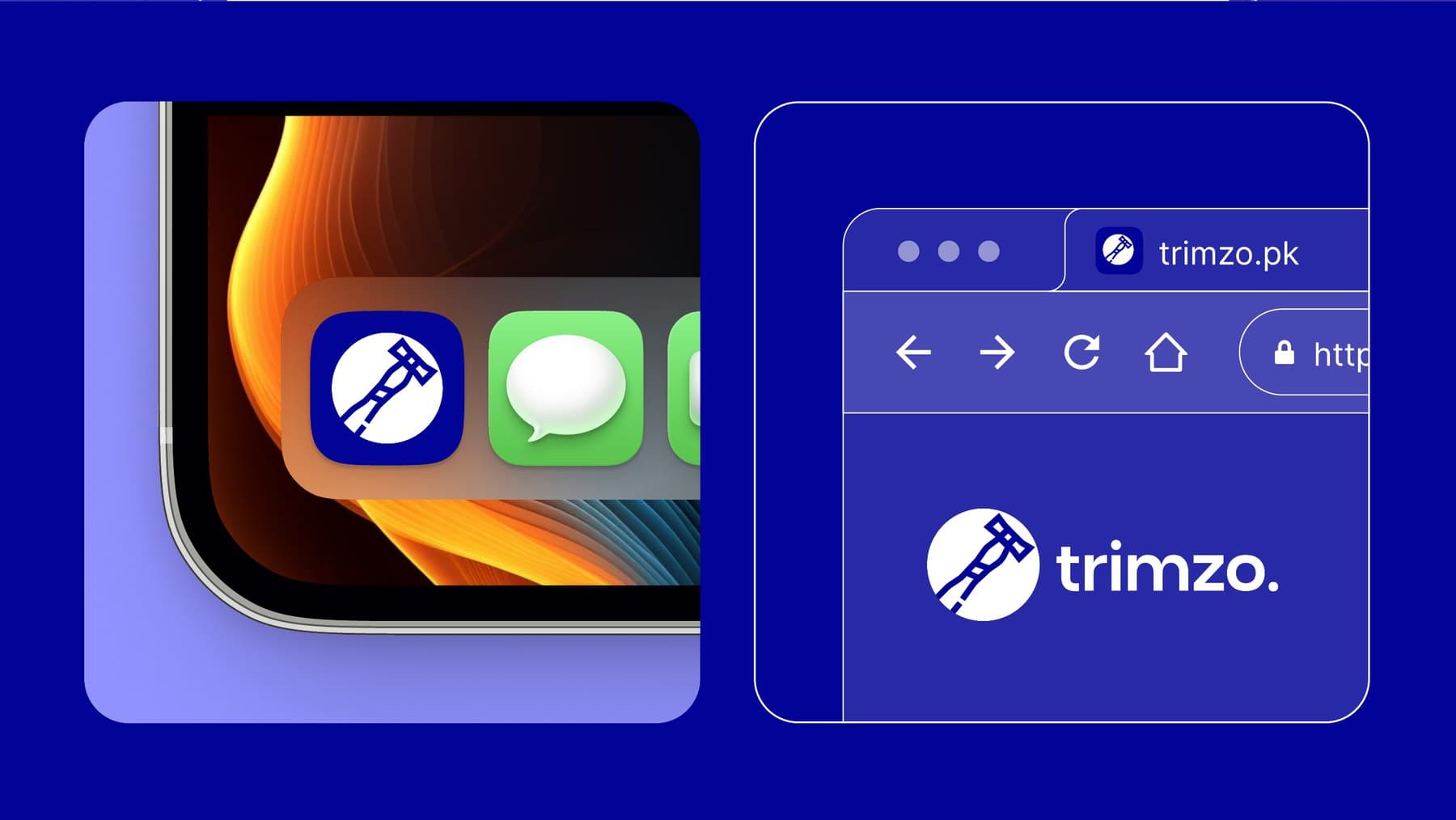
The Trimzo symbol is a stylised body razor set inside a circle — technical, minimalist and symbolic. It works as a standalone mark, an app icon and a full logomark with the wordmark.
02 — Typography
03 — Packaging
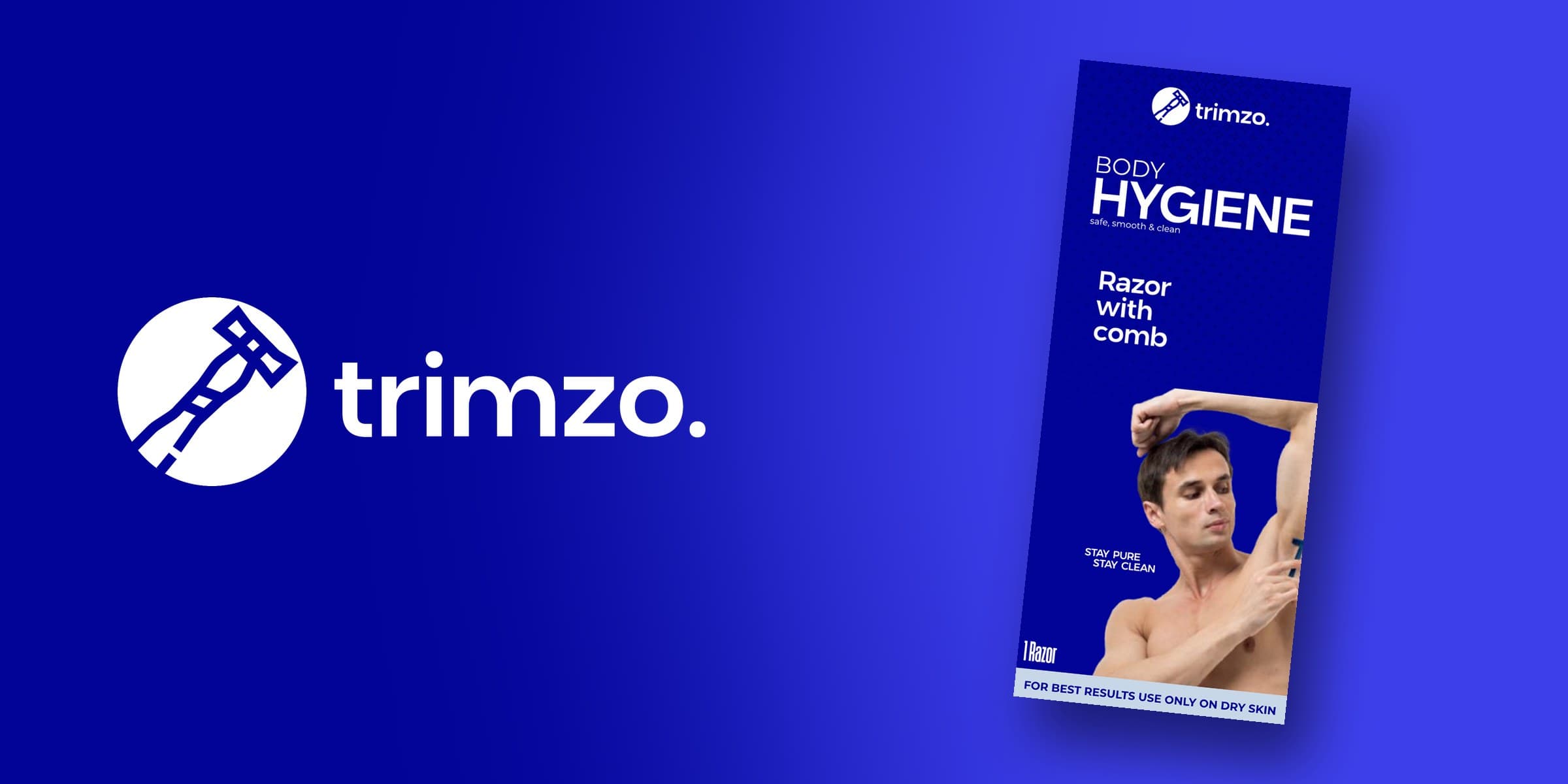
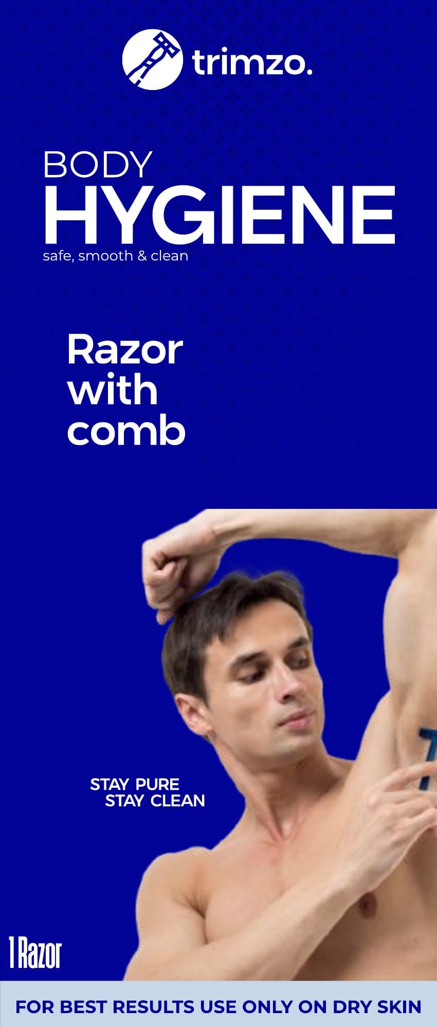
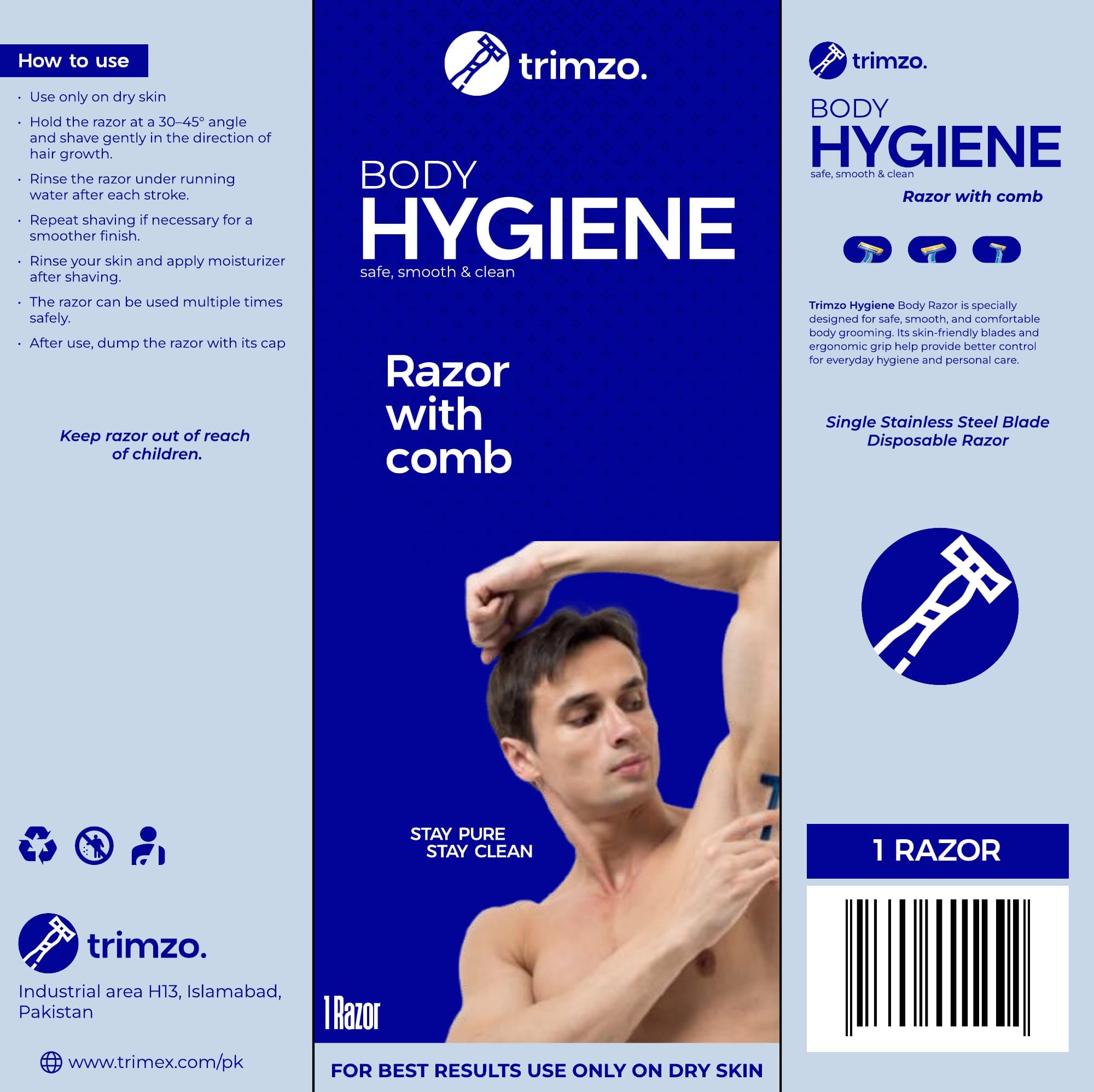
A tall single-razor packet: a bold Dark Blue front with the product promise, a light-blue side panel with usage guidance, and a clean product panel with barcode — print-ready with full dieline.
04 — Digital
- Client
- RM & Sons Pvt. Ltd.
- Brand
- Trimzo
- Designed by
- Ayyohannas — IdeaX Dubai
Contact IdeaX Dubai to create a similar custom software or luxury storefront optimized for your business.
